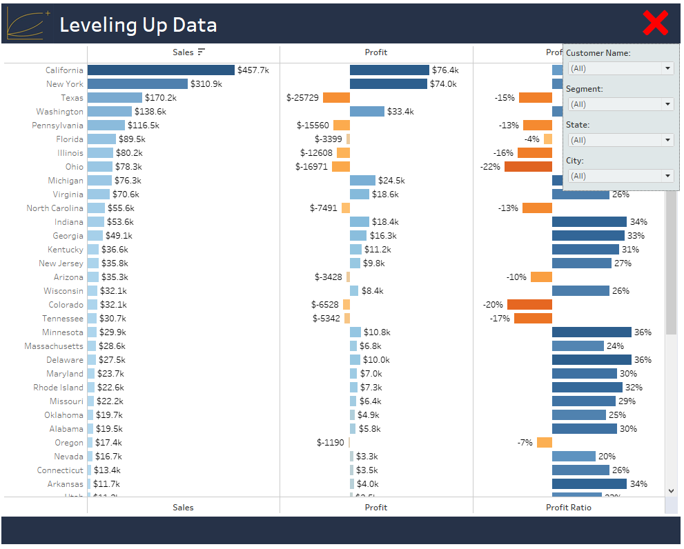
Pre-2019.2, there were some workarounds in Tableau if you wanted to save some real estate and not display filters. There was the great Robert Rouse tutorial using dashboard actions and later in 2019.1 when buttons were added one could use a button as a navigation medium to a duplicate of the dashboard but with filters. The former was a much better, more slick way of doing things, but now it’s a breeze with 2019.2 and adding show/hide feature to floating containers.
Once you have downloaded 2019.2, create your viz. For our example, we are using the Sample – Superstore data source. We want to look at Sales, Profit, and Profit Ratio by State:

For best practices, I have created a dual axis so that I can have headers on top and bottom since I might vertical scroll bars but feel free to keep it simple and just keep it single axis, whichever works for you.
Here’s what my worksheet looks like:
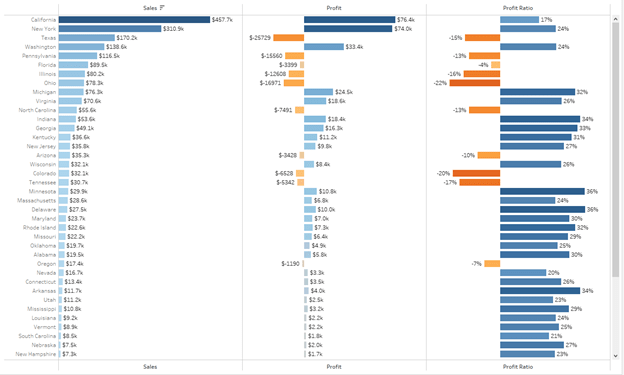
Again, don’t worry about the tidying up the labels or the diverging color marks. Next, let’s add some dimensions to our Filters card:

Again, feel free to add as many dimensions as desired, I’ve only grabbed the above four for the purposes of this demo. I’ve named the sheet “Metrics by State”.
Now let’s create a new dashboard and drag Metrics by State into the dashboard. Hide the title and you should see something like this:
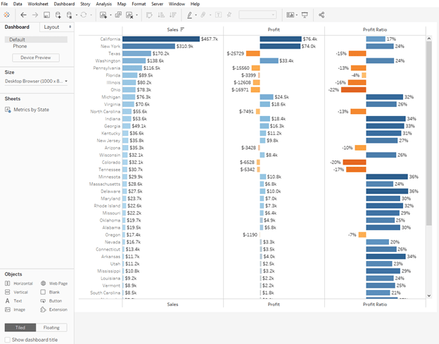
Now the cool part! Drag an empty container into the view and place it anywhere. I’ve decided to place right next to the Metrics by State Sheet:
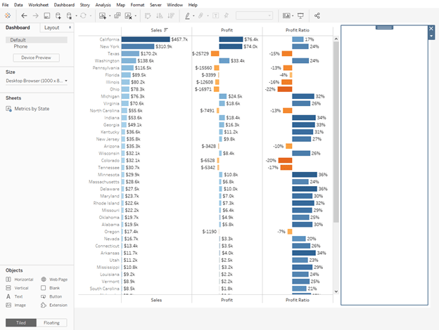
Let’s grab our dimensions that we would like to filter on and place them in this empty container. I’m going to add a border around the container and shade it a darker color:
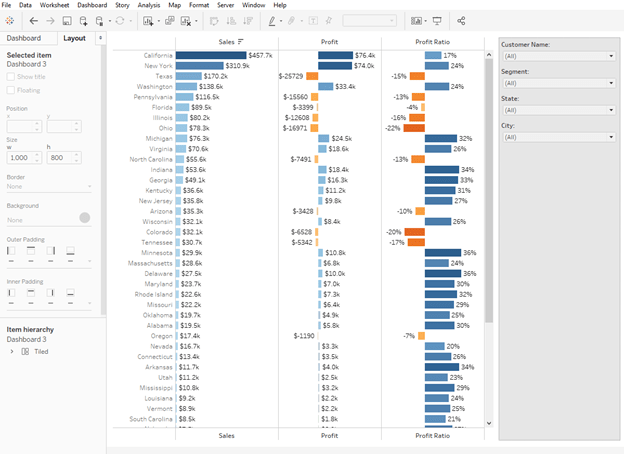
Previously you would add a title and some images and this would essentially be your dashboard. But now we can save all that space with the new Show/Hide container feature.
Select the container and make it Floating.
Select the container once more and choose Add Show/Hide Button…
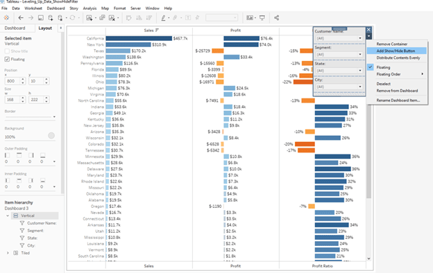
Tableau adds a button with an X on it. You can place this within your container or outside of it. For our purposes, I’ve left it outside of the filters container and strategically placed my filters container where I’d like it to appear:
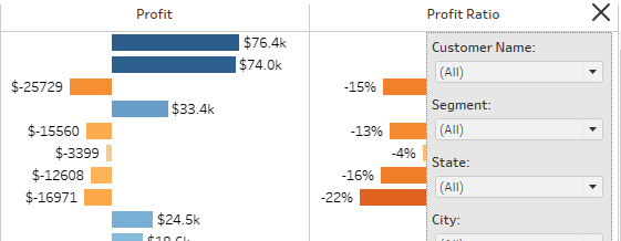
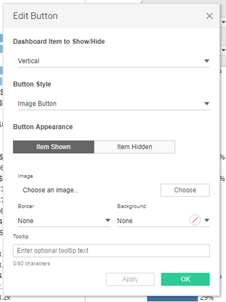
And that’s it! You can edit the button and add your own images for the menu and even add captions. Otherwise, Tableau provides the stock hamburger menu and X images for the button.
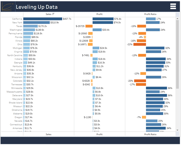
Here’s what our dashboard looks like now:
When user clicks on menu:

You can find the finalized twbx here