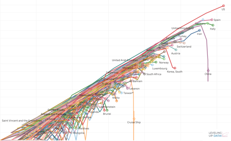
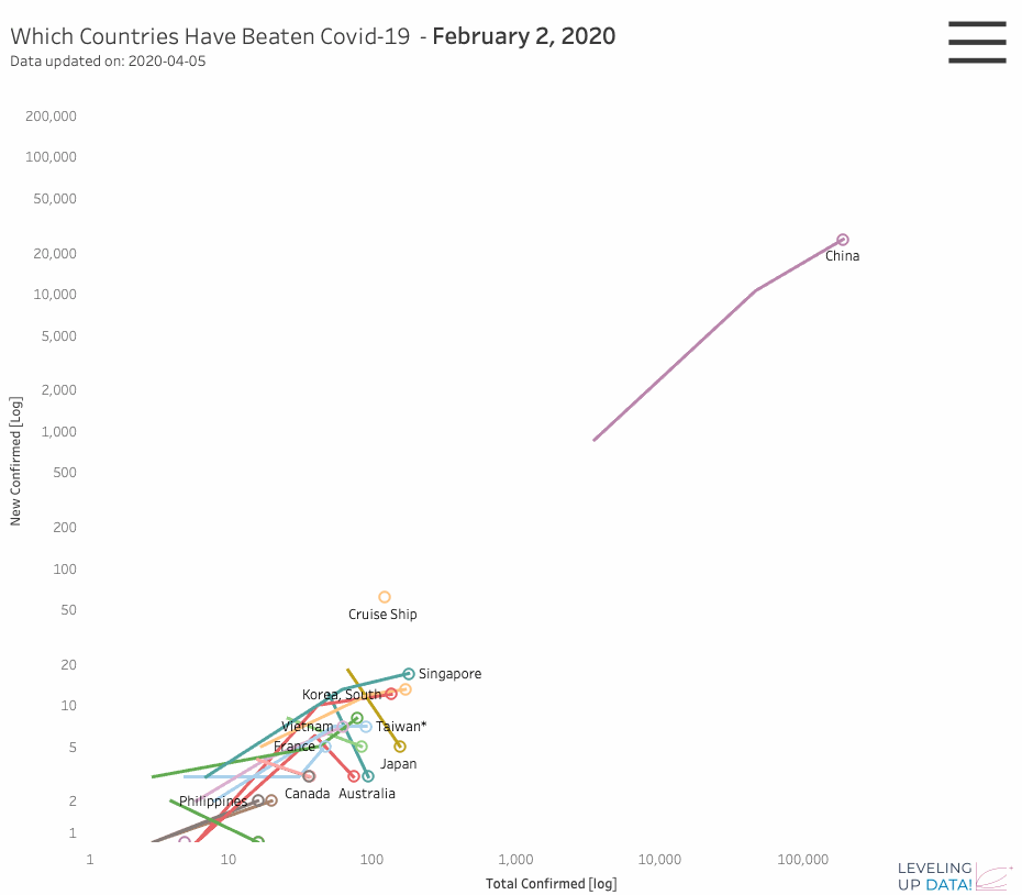
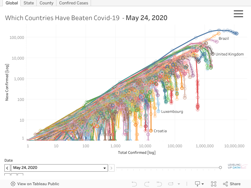
This interactive Covid-19 Tableau Visualization dashboard built with Tableau examines whether we’re actually winning the fight against COVID‑19 by looking at how different countries have managed the outbreak. It highlights nations that appear to have flattened the infection curve, shows the timing and magnitude of their peaks, and assigns each country or state a “stage of the curve” status (rising, peaking, or descending). The vsualization approach lets you compare trajectories across places to ask: Did large-scale interventions — things like social-distancing mandates or shelter-in-place orders — correlate with a noticeable flattening of the curve?
By plotting case counts over time and aligning them with policy changes, the isualization helps identify whether these mitigation actions had measurable impact. It also flags how far along each region is: whether they’re still climbing steeply, beginning to bend the curve, or flattening out into a more stable phase. The goal is to cut through the noise and answer: Is the Covid-19 Tableau Visualization showing that we are making progress, and can social interventions be credited with that progress? #COVID19 #COVIDViz #COVID19

The featured twbx can be found here.